SAAL Digital Pro-Photo Book Review
May 10, 2020Intro
It’s always somewhat tricky to leave what you’re so used to and jump into something new. This is usually associated with a different learning curve and a set of challenges. And then there comes quality; something one can be either positively or negatively surprised with.
Software is no different and perhaps even more so it serves as a good example of why habits are so difficult to break. So, I’ll talk about the SAAL design software first as I think it’s where we should start looking at the company and praise its efforts for the numerous changes implemented.
Design Software - choosing the product line and options.
Upon opening the desktop app for your design you’ll be presented with the logo and then templates to choose your preferred product line: photos, photo-book, wall decors, card, poster/fine art, calendar, photo gifts, sample set, protective wall and finally, business products. All are presented with a clean and attractive preview which radiates good user experience. I liked how clean and minimal yet informative the selection of example photos and graphics are. Thumbs up here! I also like the layout with its left-hand side panel where you can see information about (,at the time of writing this,) the cover-19 delivery as well as ongoing discounts SAAL currently has. Again, lovely, clean, separated by an elegant dark colour, the panel stands out enough yet doesn’t detract from the screen’s overall presentation.
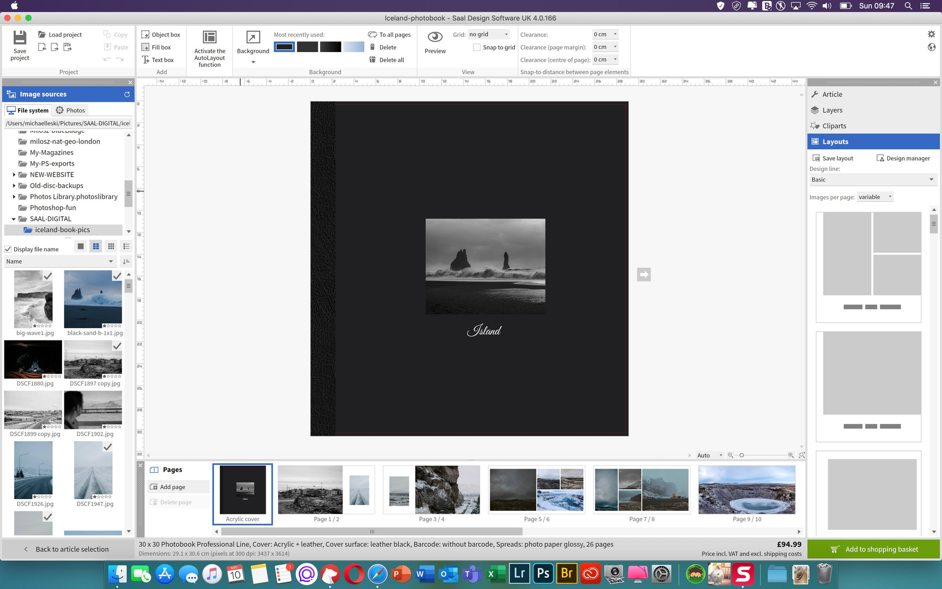
Upon choosing the photobook as the desired project, I’ve been presented with new options, sub-choices if you like, and they are shown in an elegant form with lovely previews of themed covers. I’ve chosen the one from the professional line and decided to go with the 30x30 format. The next screen is one of my favourites. First, it shows all the options for the finish of covers, spreads and pages of your book on one page. A professionally edited and colourful portrait is chosen as an example and it suits the page well thus giving you the impression you’re about to design a quality product. My choices have been acrylic and leather cover, leatherback and glossy paper. Normally I choose matte paper for my photographs and I’m happy with the execution from my usual photo books provider, therefore, I wanted to see how the glossy option pans out. I did read a recommendation of another photographer being happy with the glossy option and decided I’ll try it myself on photographs I shot in Iceland during my recent trip in February.
The final screen before moving onto the actual design would please those who prefer a quick option of the designer completing the spreads for them. You can decide to choose between three: an empty layout, where you’ll be designing the book yourself, a one-minute photo book where templates are applied and finally an auto-fill option where you can see your photographs being filled onto the pages via an intelligent assistant. I’ve decided to choose the one-minute photo book to see how the auto layouts work, to test them if you like. Plus, this option still gives me the opportunity to adjust spreads if I’m not happy with them. Moving onto the next screen in the designer, you can choose styles and they’re great if you’re new to photo book designs or do not have time to create extra graphics to adorn your book. For my project, I go with “simple”, basic as I want my images to stand out clean against the white pages.
Layouts/filling in pages and text editor
At first glance, the layout of the designer might seem overwhelming, especially to those who aren’t familiar with photo books design. However, all the options and elements of the UI are visible and I find them all necessary. I think that what we see is actually very useful and the positioning of the blocks makes sense, too! As usual, the organisation part sits conveniently on the left-hand side of the screen with the top panel being occupied by the tools and options. Everything is nicely separated by thin lines which unclutter the layout. The middle and main part of the screen is, of course, your book and it has enough white space around it to focus on properly. Finally, the right-hand side includes options for the layout types depending on how many images you’d like to place on the spreads. I find this feature extremely helpful and actually one of the most frequently used as I always put my layouts based on personal preferences. Thus, this option made it super easy.
Text is edited with the addition of a text editor which is also very intuitive, responsive and handy to use. The number of options and fonts are good, with good preview. Now, I don’t usually like to compare products naming better and worse ones but if you have ever used Blurb’s text editor and wanted to pull your hair out simply because of its quirkiness and inability to adjust to how you actually want things to look, then worry no more. Saal’s text editing is done just right and I have no complaints here.
Features I didn’t use
Located on the right-hand side you’ll find “Articles”, “Layers” and “Clipart”. As much as I appreciate the option of having the latter, I didn’t use it and I can’t think of a scenario in my professional delivery where I would. Perhaps an album from a children’s birthday party? Still, they’re there if you want them. We then have the “Articles” and “Layers” and although I didn’t “use” them I actually like that these options are there as they allow you to adjust your final finish and select extra options such as an elegant box set which I really must praise Saal for. To say the least, they match my usual professional printing lab for their quality and if anyone is looking for an extra elegant touch, they should consider this option. I recommend it. Preview
The preview button is easily visible and conveniently located on the top. Upon clicking it initiates the preview of your final design and as with any other software, it ensures to give you exactly the product you’re about to order. Scrolling through the pages is easy and it’s done with the use of left-right buttons with the “deactivate preview” button placed in the top left. What I like is the overall conclusion and house style design of the user interface which carries onto the preview process and thus feels consistent. This isn’t difficult to use, clogged and buggy software I’ve had an experience with when designing albums with other brands. Saal’s is clean and pleasant to use and although I won’t be switching to it anytime soon due to my long and well-established successful relationship with my current printing lab, I would recommend them if you’d like to try out something new, especially in the design process of things. Plus, the quality of the finish is actually very good indeed!
Quality of the final product
As mentioned above I’ve decided to go with leather and acrylic finishes for the cover and leather for the back. I chose black as my colour for the photobook as I wanted to match it to the photographs from Iceland I came back with at the end of February. And because the photographs are often moody, gritty and portray Iceland in a somewhat mystical manner, I thought it’d be a good idea. It was, however, an experiment and you never actually know until you run a test print. I’m glad I did choose the finish and the colour mentioned as the final photo0book which arrived in just under 2 weeks (, due to the current pandemic situation,) actually surprised me in a very positive way. The materials feel and are solid with good touch responsiveness to them and I’m guessing they’ll last. At least that’s my first impressions.
Onto the pages and the choice of paper. I also experimented with this and I’m glad to say I’m not disappointed with the quality the glossy paper provides. I can’t speak for another line of Saal photo books but I can say with my hand on heart that the pages and print quality are amazing! I wasn’t expecting this and actually when investigating the pricing offered by other printing labs, Saal is both competitively placed and better on the quality front. Greatly impressed by the paper here, the sheen on the finish as well as the lay-flat option which can be executed badly sometimes.
Final thoughts
So the question is “Is SAAL’s new line of products worth it?” Absolutely! And again, although I’m solidly placed and tied by a very good relationship with my printing lab, I wouldn’t mind recommending SAAL services to photographers both professional and enthusiasts who want to try something new and premium. The quality of the products is great, the design process intuitive and communication with the support, if needed, very good indeed. What’s not to like?
With huge thanks to SAAL for letting me try their new pro-photo book product line.
Michael,
Wedding photographer
You can try SAAL Digital products and services by clicking here.